Graduation: One Story
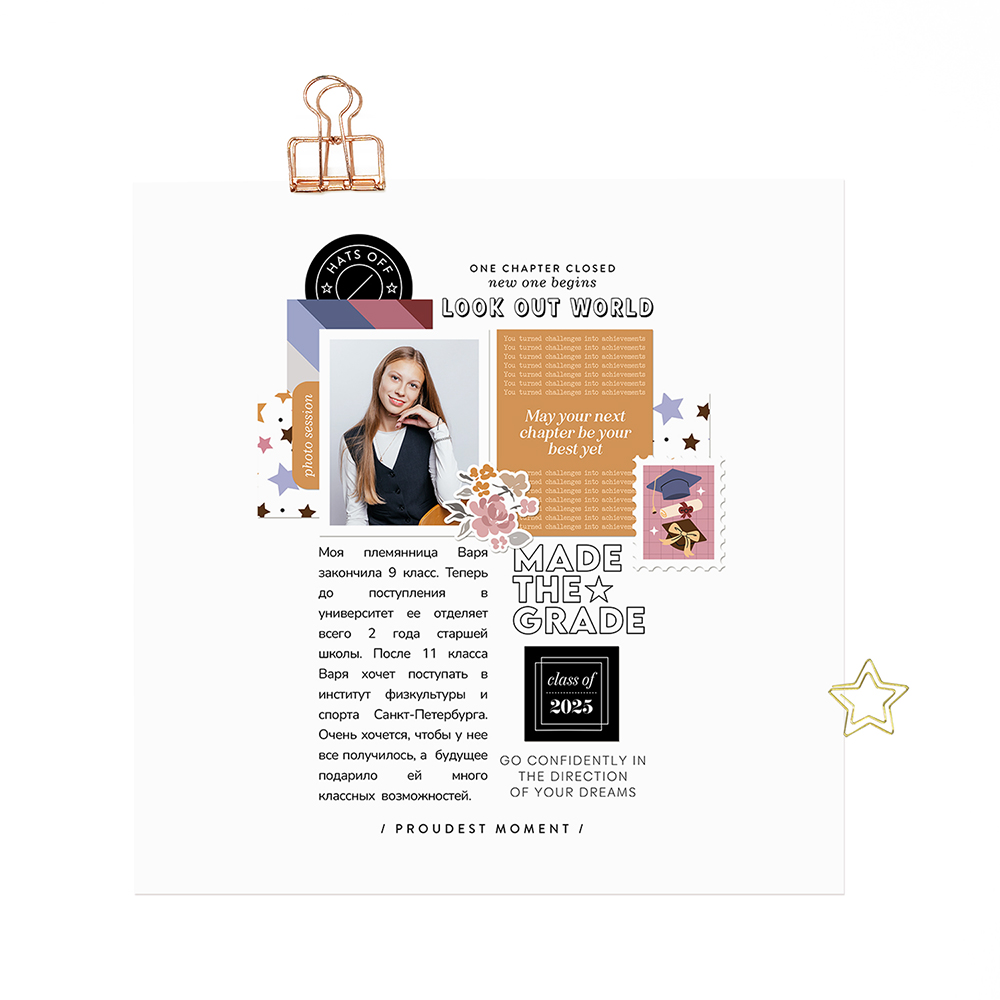
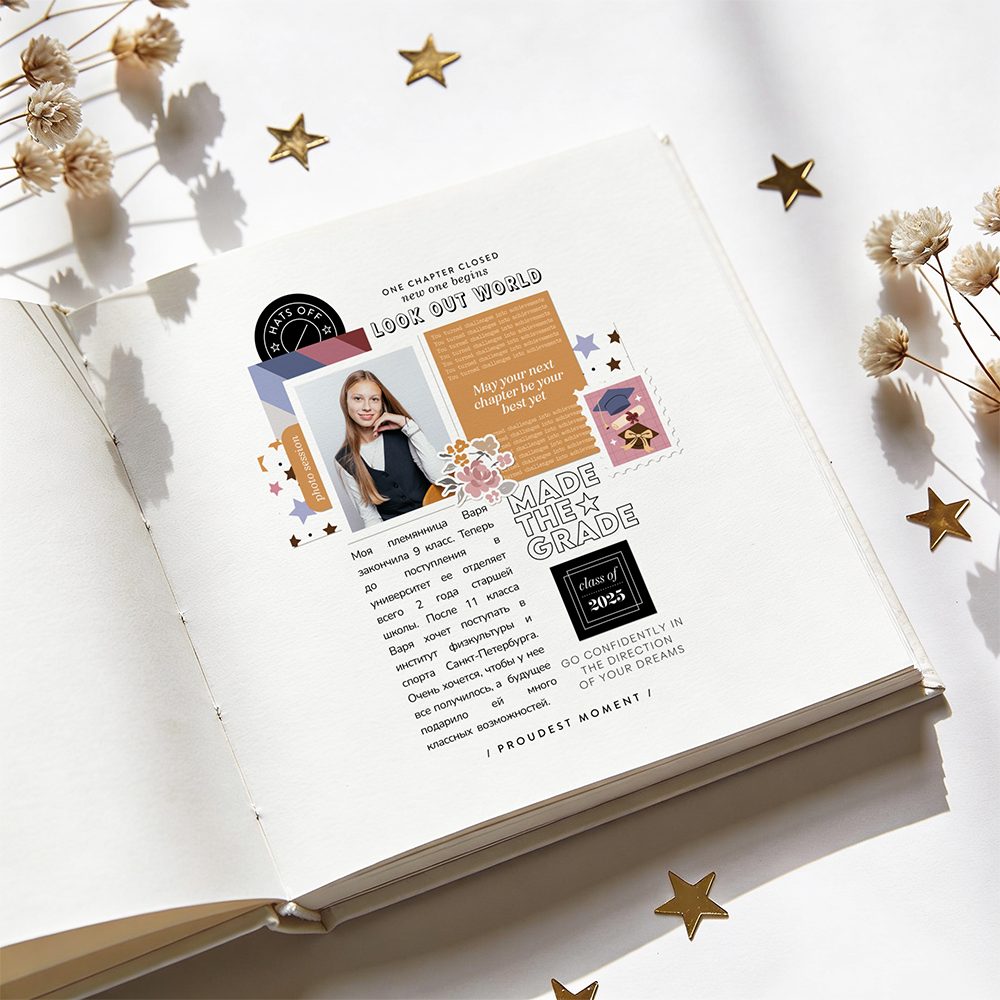
When people think about pocket life kits, they often imagine Project Life albums or traveler’s notebook spreads. Because these kits usually include many journaling cards, some scrapbookers hesitate to use them for traditional scrapbook layouts, especially larger pages. With the Graduation kit, I wanted to show that pocket-style products can work beautifully beyond pocket pages. Journaling cards, digital stamps, tags, and word strips can easily become part of a traditional scrapbook composition, especially if you enjoy a clean and simple style. For this layout, I created a page about my niece, who graduated from 9th grade last year. She is already a professional swimmer and plans to apply to the Institute of Physical Education and Sports in Saint Petersburg after finishing school. I wanted this page to feel calm, proud, and modern — focused more on her future and personality than on heavy decoration. This project also became a perfect example of how pocket life products can be transformed into a full traditional scrapbook page with just a few thoughtful design choices.
To create this page, I started with a ready-made template that is available as a free add-on to the kit. Using a template makes the process much easier, especially when you want a clean and balanced composition without spending too much time arranging elements from scratch. The template already included the basic structure of the page, which allowed me to focus on the story, photo, and small decorative details instead of worrying about placement. I especially like using templates for clean and simple layouts because they help keep enough white space while still making the page feel complete. For the main photo, I chose a portrait of my niece taken on the day of her graduation. Since the photo already carries a strong emotional focus, I didn’t want to overwhelm it with too many decorations. Instead, I used a few carefully chosen elements from the pocket life kits to support the story and highlight the graduation theme. This approach clearly shows that pocket life products can work beautifully in traditional scrapbooking. Even simple journaling cards and stamps can become part of a larger, layered composition when used thoughtfully.
I always enjoy working with a white background, so for this page I kept the base clean and minimal. It gives the design more breathing space and allows the photo and small elements to stand out without visual noise. Next to the photo, I placed a journaling card with good wishes. I chose it specifically because its color echoes the tone of the chair in the photo. This is a small but important detail — matching colors between your photo and design elements helps the whole page feel more cohesive and natural. Under the photo and journaling card, I added two patterned cards with stars and stripes. These subtle patterns bring structure and rhythm to the lower part of the composition without overwhelming the main focal point. To the side of the photo, I attached a small tag with the word “photo session.” I also visually connected the photo and the quote card using a floral cluster from another kit. I love mixing elements from different sets — it makes the page feel more personal and layered. To balance the composition, I added a post stamp element with a graduation theme (caps and diploma), which reinforces the story.
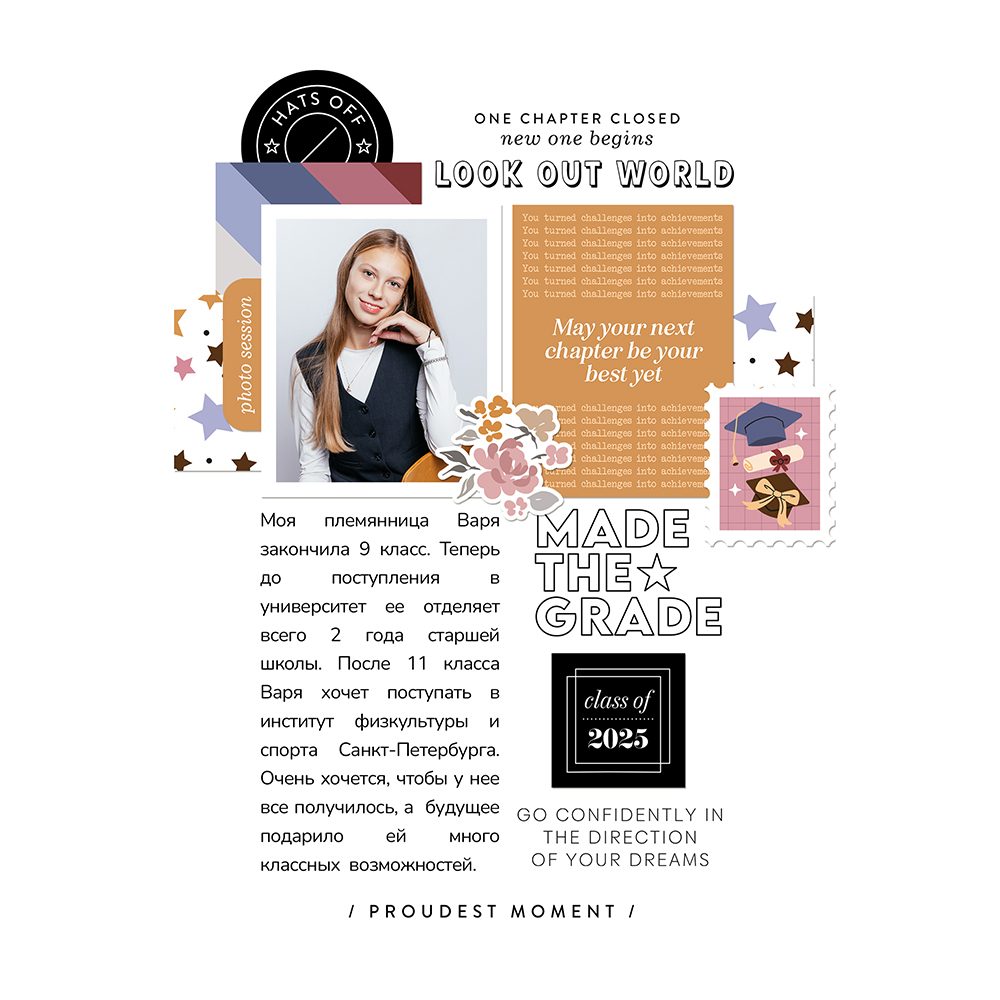
For the stamped elements, I created two custom black tags — one round and one square — and placed them at the top and bottom of the page to visually anchor the composition. To create the square tag in Photoshop, I opened the stamp, increased the canvas size by 100 px both horizontally and vertically, added a new layer and simple filled it with black color, and changed the stamp color to white. After merging the layers, the tag was ready. For the round tag, I followed a similar process: I expanded the canvas by 200 px, drew a black circle on a new layer bigger as the stamp, changed the stamp color to white, and merged everything together. Finally, I added a piece of journaling and a few additional stamps to complete the page.
Design tip: working with white space in clean & simple layouts
When working in a clean and simple style, white space is not empty space — it is an active part of the design. It helps separate elements, guide the eye, and create a sense of calm within the composition. Using a white background allows you to focus on a few key elements instead of filling every area of the page. This makes it easier to highlight meaningful details, such as the photo, small journaling cards, or stamped accents. Another important aspect is balance. Even in minimal layouts, placing small elements strategically across the page — top and bottom, left and right — helps create visual stability without adding clutter.
This page is a simple example of how pocket life kits can be used beyond traditional pocket-style albums. Journaling cards, patterned elements, and digital stamps can easily become part of a full scrapbook layout when combined thoughtfully. For me, the Graduation kit was not just about documenting an achievement, but about showing how flexible these materials can be. With a few adjustments, they can fit into different styles — from pocket pages to clean and simple traditional layouts. If you’ve ever felt unsure about using journaling cards in your scrapbook pages, I hope this inspires you to try combining them with your own photos and favorite techniques. Sometimes the most interesting results come from rethinking how we use familiar elements.
Liked this post? Give it a like!
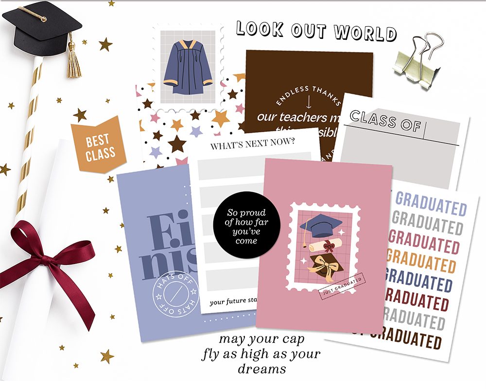
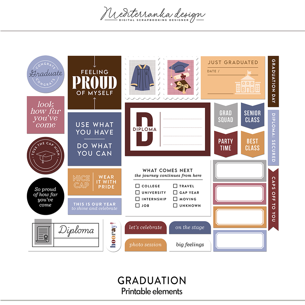
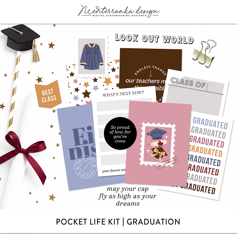
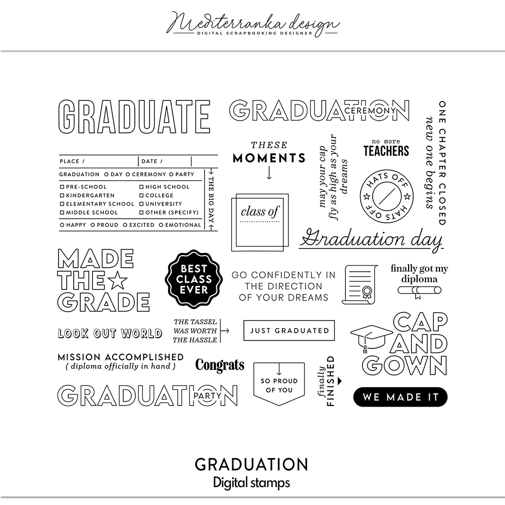
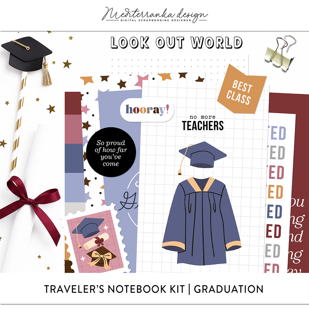
PRODUCTS I USED IN THIS TUTORIAL
Olesya Rudenko Manaz
Hi there! I’m a graphic designer, scrapbooker and storyteller. I enjoy creating quality supplies to make scrapbooking and storytelling easy, fun and practical for you.
