Fitness Routine: One Story
The Fitness Routine kit is about more than just workouts — it’s about motivation, consistency, and the small decisions that shape our daily routines. For this page, I wanted to document a short chapter from my life when I was trying to build a new rhythm after moving to Germany. It was a time of transition, when everything still felt unfamiliar and unsettled. New surroundings often push us to rethink even the simplest habits, including how we take care of our bodies. I was looking for something that would help me feel more grounded and energized at the same time. Fitness became one of the ways to reconnect with a sense of normality. This page captures one of those early attempts to establish a routine in a completely new environment.
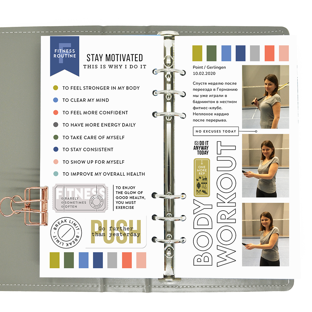
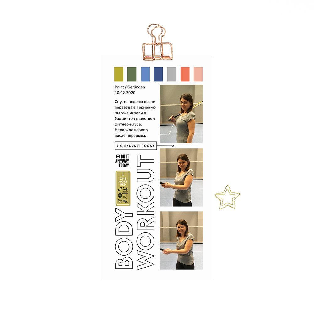
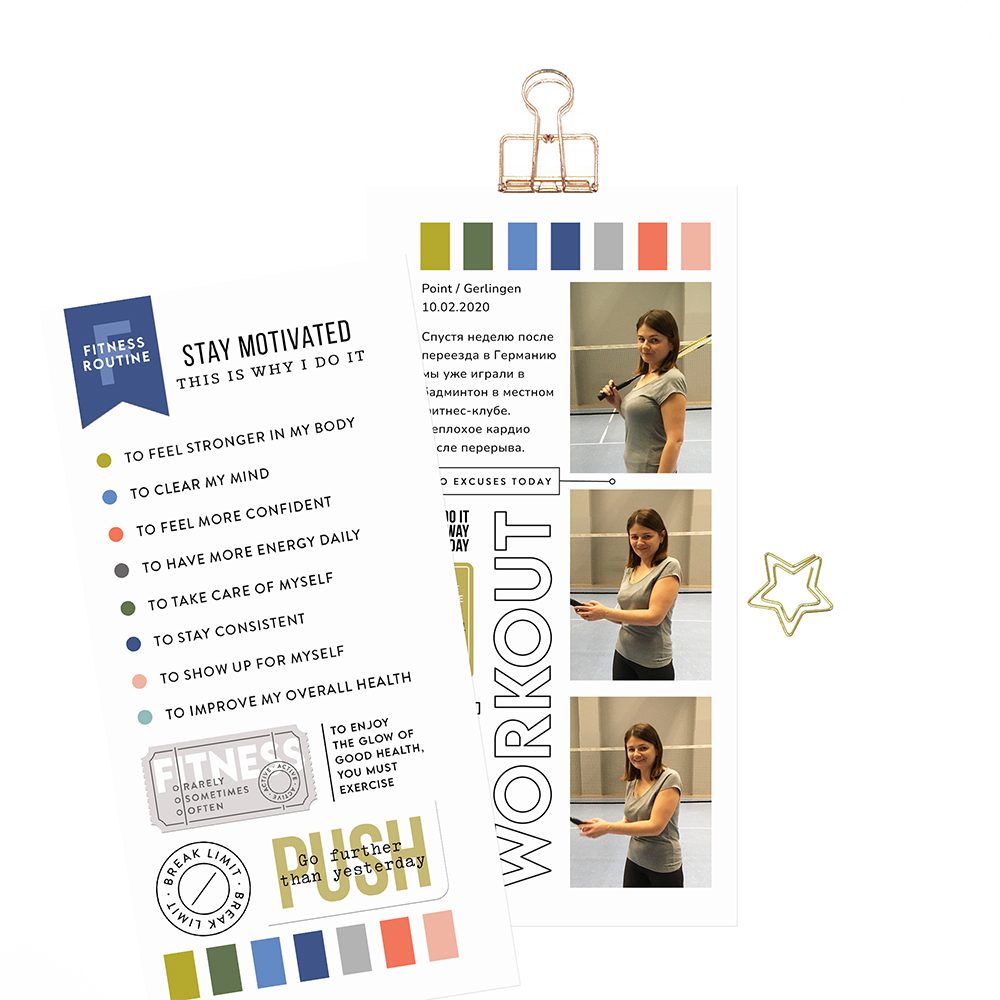
For this spread, I used a series of three photos from one of our badminton sessions. About a week after moving to Germany in 2020, my husband and I joined a local gym, hoping to build a new routine together. Badminton felt like a perfect choice for cardio — active, engaging, and a little more playful than a traditional workout. However, I quickly realized that I hadn’t played in years, and it was much harder than I remembered. Constant movement and quick reactions required more effort than I expected. As a child, I used to be very good at badminton, almost like a “queen of the court,” so coming back to it as an adult felt both nostalgic and challenging. For a while, we kept going regularly, but eventually this routine faded, and we both returned to our usual runs instead.

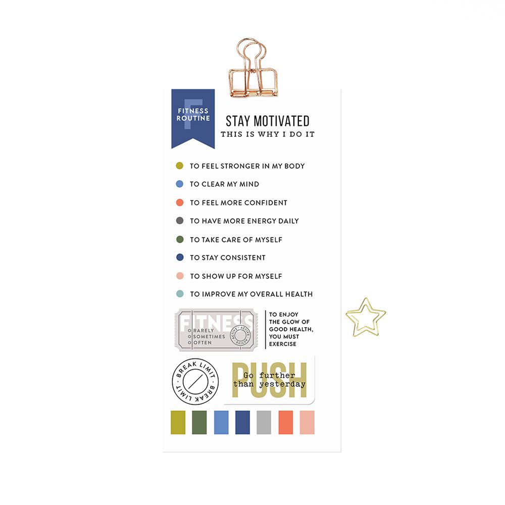
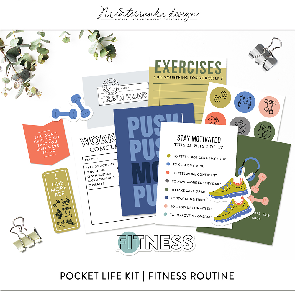
For the left side of the spread, I used the “Stay Motivated” Traveler’s notebook insert from the kit as the main element. It already includes a list of reasons why we choose to stay active, and for this page, it naturally became the core of the entire story. Instead of writing a long piece of journaling, I let this structured list speak for itself. I really like using this kind of pre-designed list in my pages. It brings clarity and focus, and at the same time, it reflects something more personal — not just what I did, but why I keep coming back to movement again and again. On this page, it connects different moments of my life: from playing badminton as a child to trying to build a routine again as an adult.
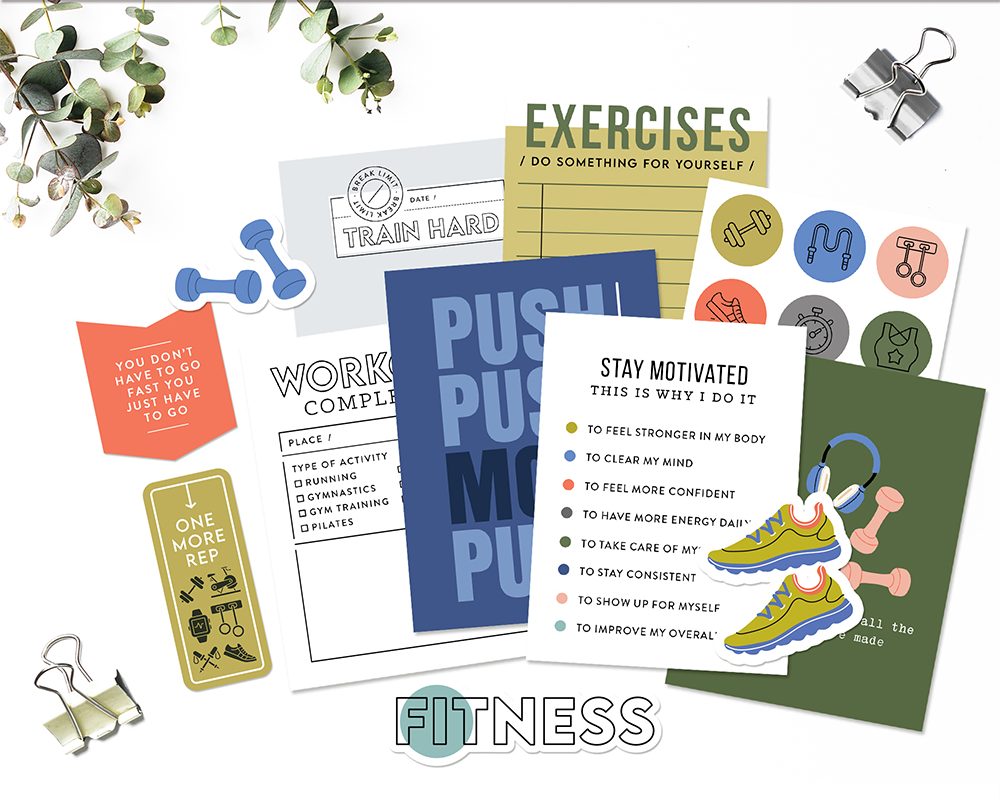
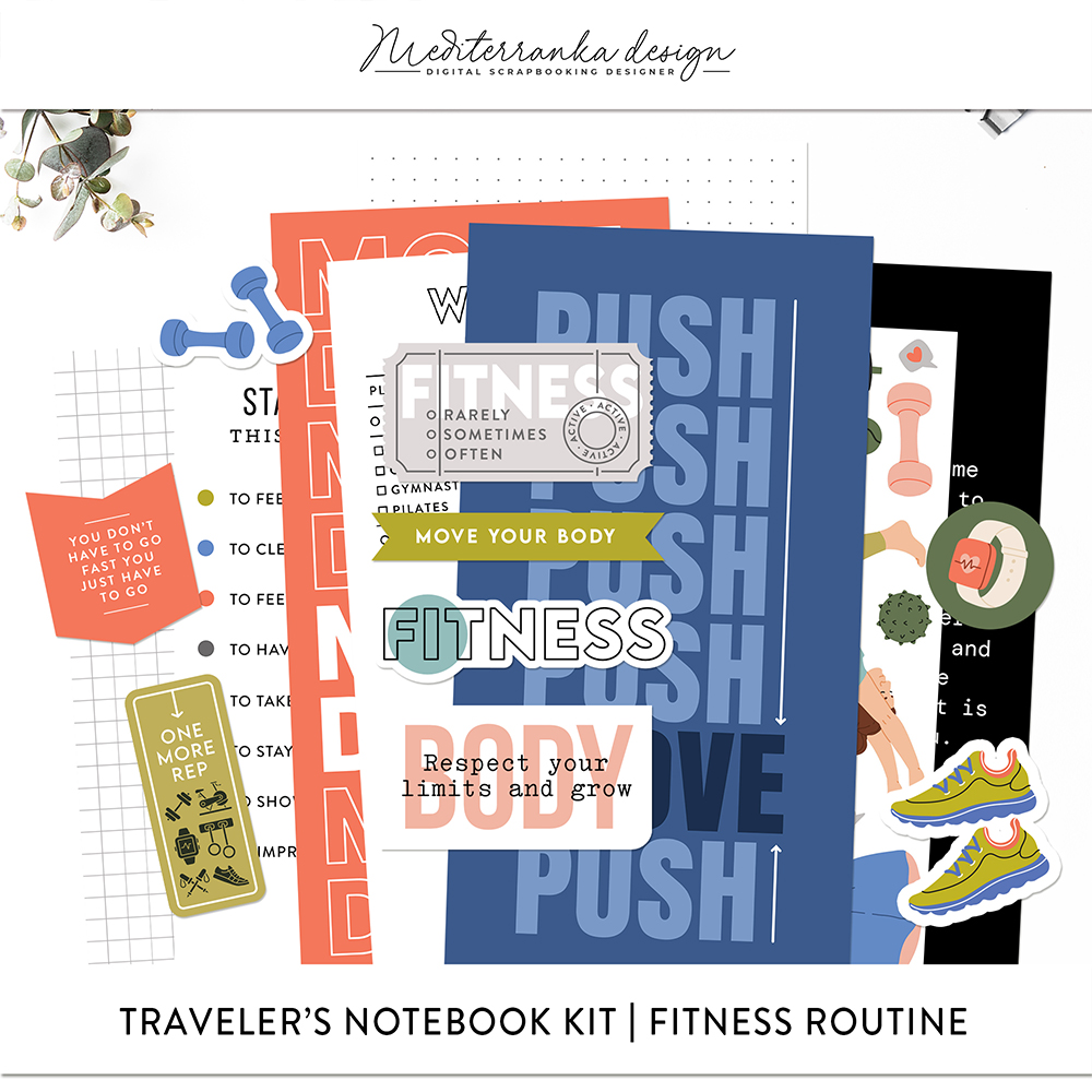
To support the composition, I added colored strips at the bottom of the page. This simple detail helps ground the layout visually and prevents it from feeling too empty. It also creates a clear base for the entire page and makes the design feel more stable. At the very end, I added a few printable elements and digital stamps. These small accents help bring the page to life and add a bit of personality without taking attention away from the main element. I like finishing pages this way — once everything is in place, these details make the composition feel complete.
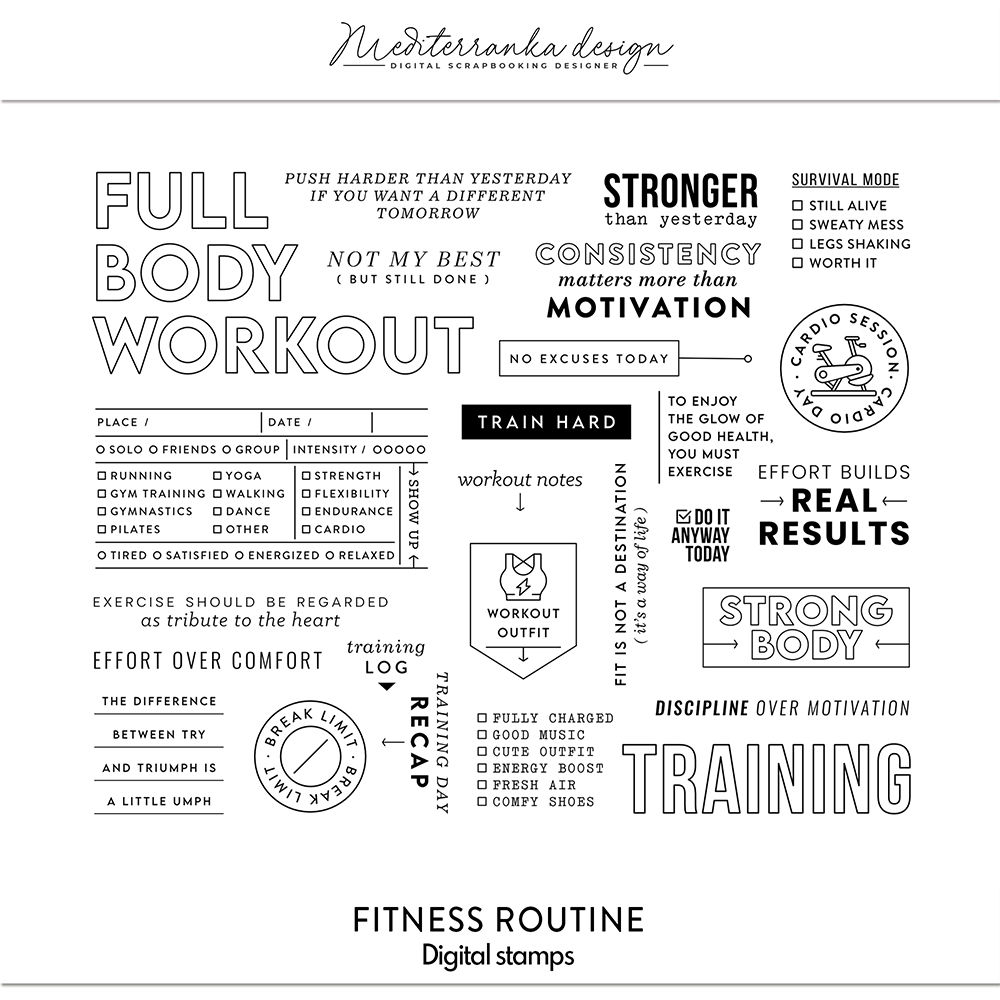
For the right side of the spread, I repeated the same colored strips at the top of the page to create a visual connection with the left side. This simple repetition helps tie the two pages together and makes the whole spread feel cohesive. I arranged a series of three photos vertically along the right edge, placing them one under another. This vertical line naturally draws the eye down the page and works especially well for action shots, where movement continues from one image to the next. To the left of the photos, just below the strips, I added the date, location, and a short piece of journaling — just a couple of sentences to capture the moment. Right next to it, I included a stamp “no excuses today,” which perfectly reflects the mindset behind this page. As a main title, I used the large “body workout” stamp and rotated it so it runs vertically from bottom to top alongside the photos. It takes up about a quarter of the page and acts as a strong visual anchor, balancing the photo column on the right. To finish the page, I added a printable element and a small digital stamp “do it anyway today.” These final details reinforce the message and add rhythm to the composition without making it feel overloaded.
Design tip: repetition and vertical flow
Repeating small elements across a spread is one of the easiest ways to create a cohesive design. In this case, the colored strips appear on both pages, but in different positions, which keeps the layout connected without making it feel repetitive. The vertical arrangement of photos is another effective technique, especially when working with a series. It creates a natural flow and guides the eye through the page, making the story feel continuous and easy to follow. Combining repetition with a strong vertical element — like a column of photos or a rotated title — helps balance the composition and gives the page a clear structure.
Fitness routines come and go, and not every attempt turns into a long-term habit. But even short phases like this one become part of the bigger story — how we move, how we try, and how we keep coming back to it in different ways. This page is a small reminder that motivation doesn’t always have to be perfect or consistent. Sometimes it’s just about showing up, trying something new, and allowing yourself to enjoy the process, even if it doesn’t last forever. The Fitness Routine kit is perfect for capturing these kinds of moments — not just progress, but the reasons behind it, the mindset, and the small details that often matter the most. If you have photos from your own workouts, routines, or even short-lived attempts, try turning them into a page. You might discover that these everyday moments tell a much richer story than you expected.
Liked this post? Give it a like!
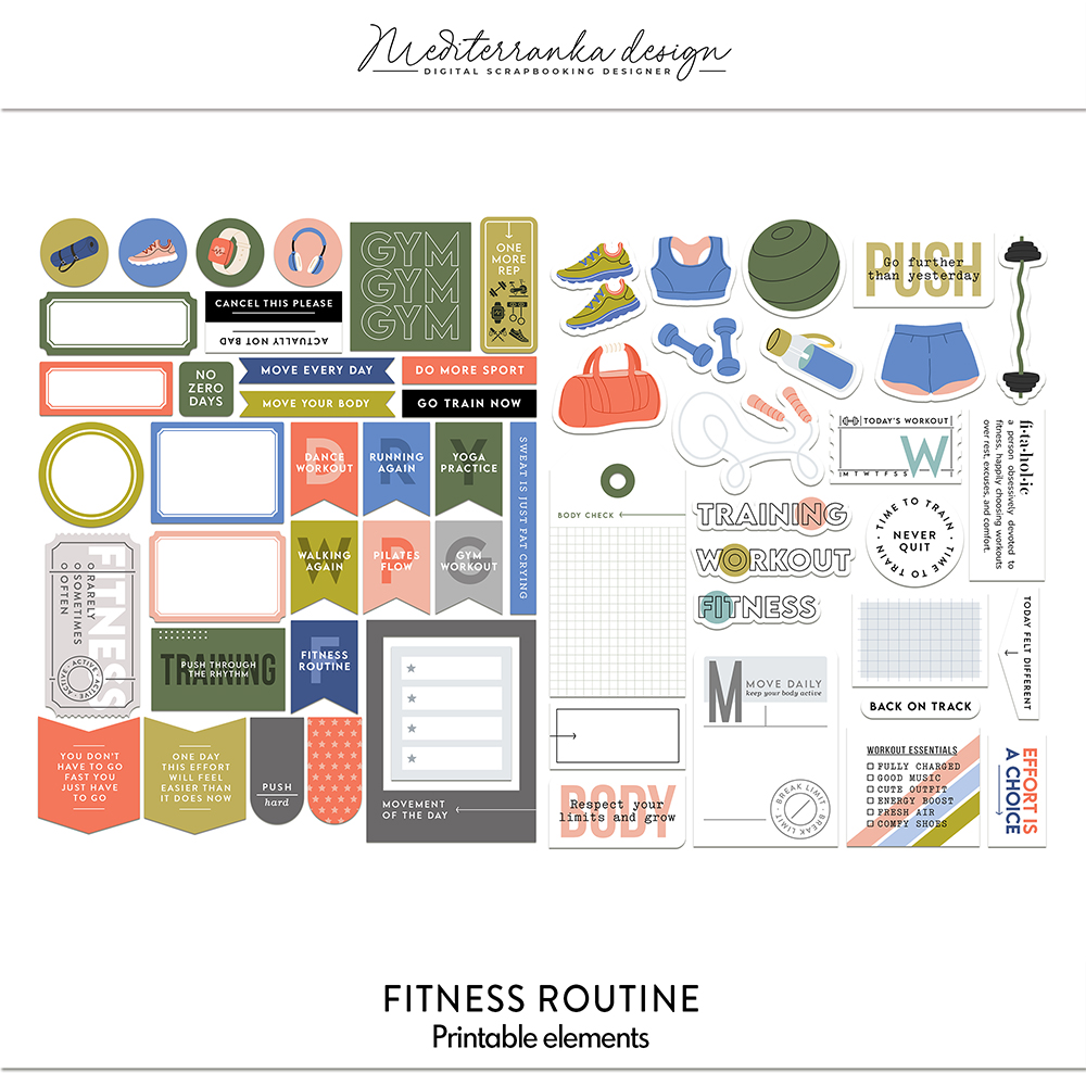
PRODUCTS I USED IN THIS TUTORIAL
Olesya Rudenko Manaz
Hi there! I’m a graphic designer, scrapbooker and storyteller. I enjoy creating quality supplies to make scrapbooking and storytelling easy, fun and practical for you.

Fitness prompts
