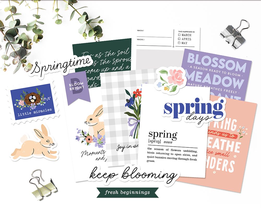
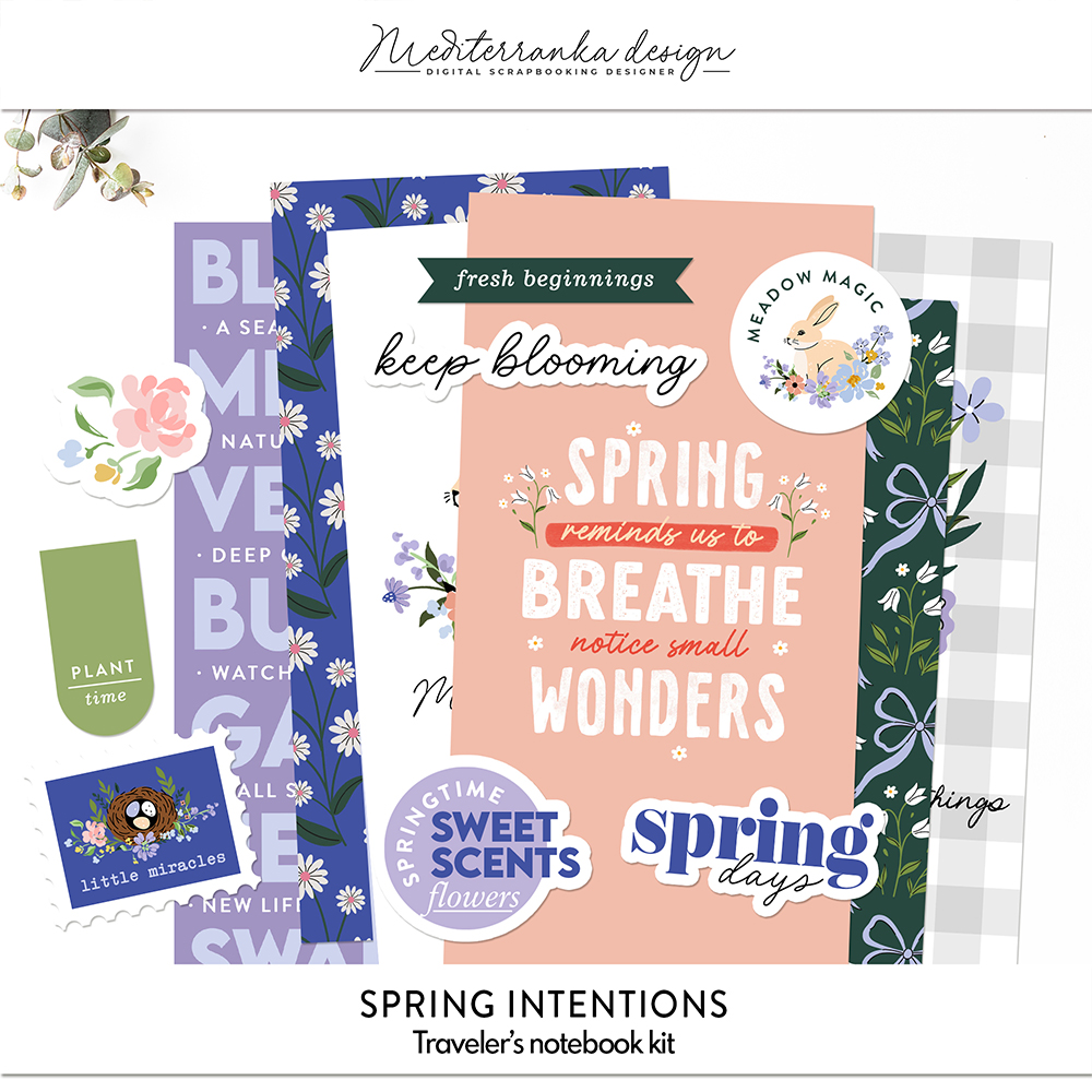
One Story: Spring Intentions
The Spring Intentions kit is all about fresh starts, small promises to ourselves, and the quiet shift from winter stillness to outdoor living. For this page, I wanted to capture a simple but meaningful milestone of the season — our very first outdoor meal of the year. The color palette of the kit reflects this awakening of nature. A deep blue-green brings depth and balance, paired with pale pink and soft lavender tones that echo the delicate blooms of early spring. Dark blue grounds the palette, while vibrant green and pale blue highlight the freshness of the season. The elements themselves enhance the story: swallows in flight, snowdrops, various flowers, a nest with eggs nestled among blooms, and playful rabbits. Each piece speaks to the new beginnings that spring brings — growth, renewal, and the quiet joy of observing nature stir back to life. There is something special about that first picnic. It’s not just about the food. It’s about stepping outside again, feeling the air change, and realizing that a new season has truly begun.
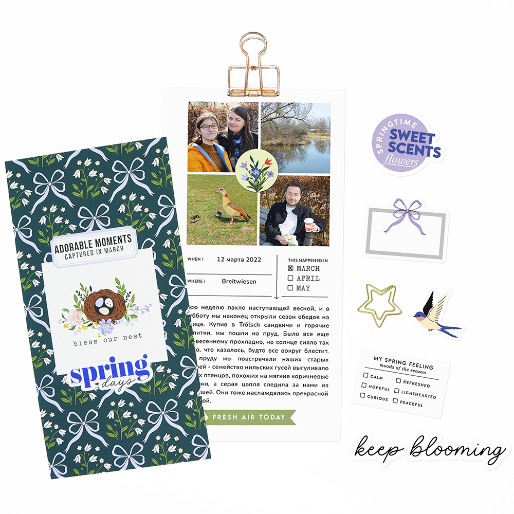
For this page, I used the journaling prompt: “Tell the story of your first outdoor meal this season.” It was the perfect starting point for these photos from our first Saturday picnic of the year. It was the second week of March 2022. The air had carried the unmistakable scent of spring all week, and finally, on Saturday, we opened the outdoor dining season. We picked up sandwiches and hot drinks from our favorite bakery and headed to the pond. The day was still cool, but the sun shone so brightly that everything seemed to sparkle. At the pond, we met some familiar friends — a family of Egyptian geese with fluffy brown chicks, waddling along the freshly green banks in search of snacks. A grey heron peeked at us from the reeds, calmly observing. It was wonderful to sit on a sunlit bench, enjoying sandwiches and hot tea, fully immersed in the simple joy of the season.
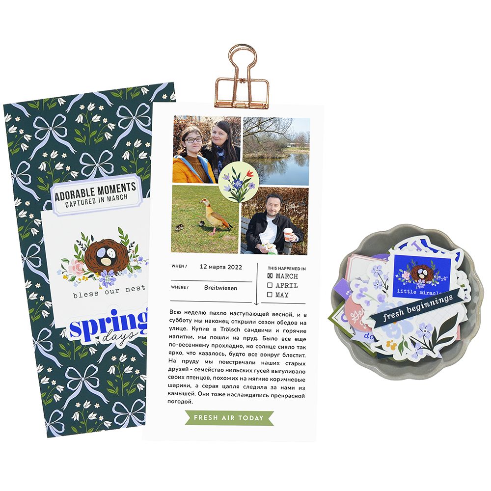
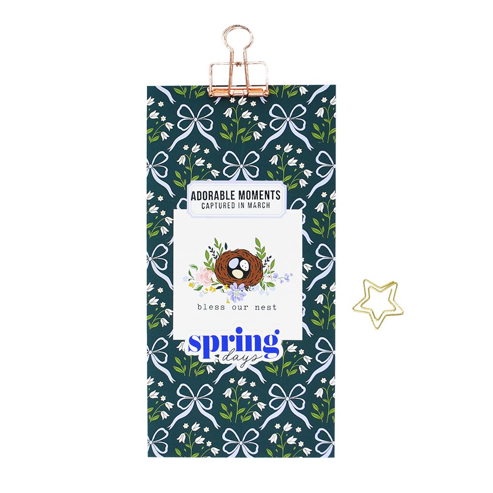
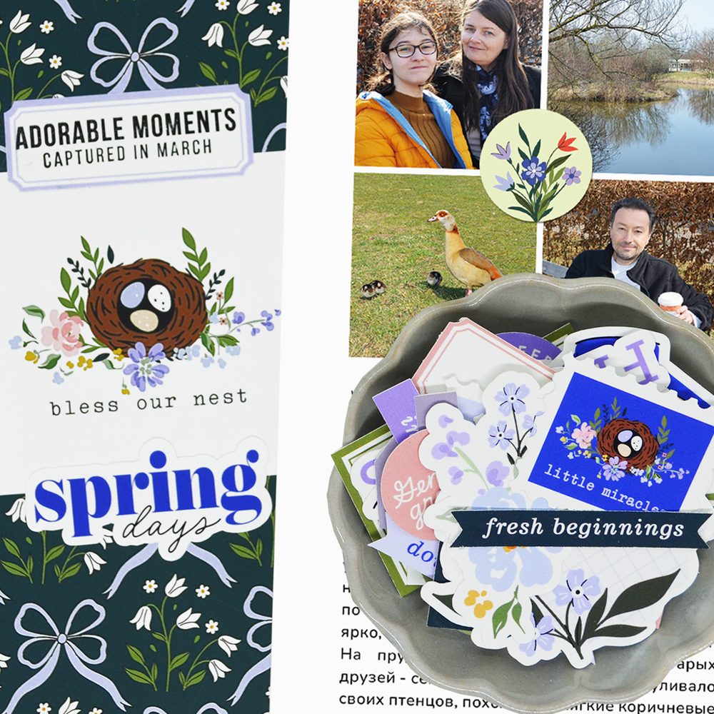
For the right half of the spread, I chose a Traveler’s Notebook insert with a delicate bow and snowdrop pattern on a deep blue-green background. It creates a beautiful contrast with the lighter left side of the page and brings depth and visual balance to the overall layout. Layered on top, I added a card featuring a nest with eggs surrounded by flowers — a symbol of new beginnings, protection, and the quiet anticipation that comes with early spring. It perfectly echoes the theme of the Spring Intentions kit: renewal, growth, and gentle seasonal transitions. I adhered the title “spring days” and, over a tag, stamped the phrase “adorable moments – captured in March” using black ink and a sentiment from the spring clear stamp set. This phrase felt especially fitting because the page isn’t about a grand event — it’s about small, fleeting scenes: warm tea in cold hands, sunlight on the pond, fluffy goslings by the shore. These are the kinds of moments that might seem ordinary at first, but later become the memories that define a season.
On the right side of the spread, I placed the photos and journaling together as one cohesive storytelling block. I arranged four square photos to capture these moments. This multiple-photos layout works beautifully to show a series of small details — the birds, the sparkling pond, the sunlit bench — all connected to the story. Using square photos in a multiple-image layout makes the page feel structured and balanced. Squares naturally create a clean grid, which is especially helpful when working with four images. The symmetry keeps the composition calm and organized, allowing the story to unfold without visual clutter. Another advantage of the square format is focus. By cropping photos into squares, you remove distractions and highlight the most meaningful details — like the geese by the water, the sparkle on the pond, or the warmth of the sunlit bench. Finally, squares pair beautifully with layered embellishments. Because the layout is structured, you can confidently add circular tags, stamps, or small accents without overwhelming the page. The contrast between geometric structure (squares) and softer elements (flowers, tags, wordbits) creates a dynamic but harmonious result. If you’re documenting a sequence of moments rather than one single highlight, try a square grid — it’s simple, effective, and always timeless.
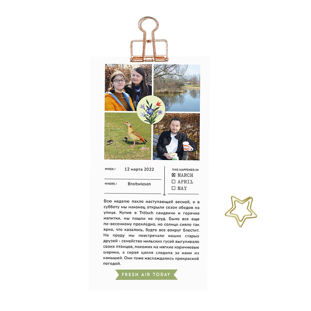
To visually unite all four images, I added a round floral tag right at their intersection point. It acts almost like a soft focal anchor, gently tying the photos together and preventing the grid from feeling too rigid. The circular shape also contrasts nicely with the square format, adding movement and flow to the composition. Beneath the photo block, I placed a ready-made stamp from the kit where I recorded the date and location of our picnic and marked March with a small cross. I love including these tiny documentary details — they ground the page in a real moment in time. Below that, I added my journaling and finished the page with the green wordbit “fresh air today.” It felt like the perfect closing note — simple, honest, and exactly what that day was about.
Spring doesn’t always arrive with grand gestures. Sometimes it begins with a quiet picnic, warm tea in cool air, and the simple decision to step outside again. The Spring Intentions kit was designed for exactly these kinds of stories — the gentle transitions, the small seasonal rituals, the moments that mark a new beginning in subtle ways. If you’re starting to feel that shift into spring, try one of the prompts you can find on my blog and let it guide your storytelling. Gather a few photos, document the details, and allow your page to reflect your own version of renewal. Because often, it’s the ordinary days that become the most meaningful chapters of the season.
Liked this post? Give it a like!

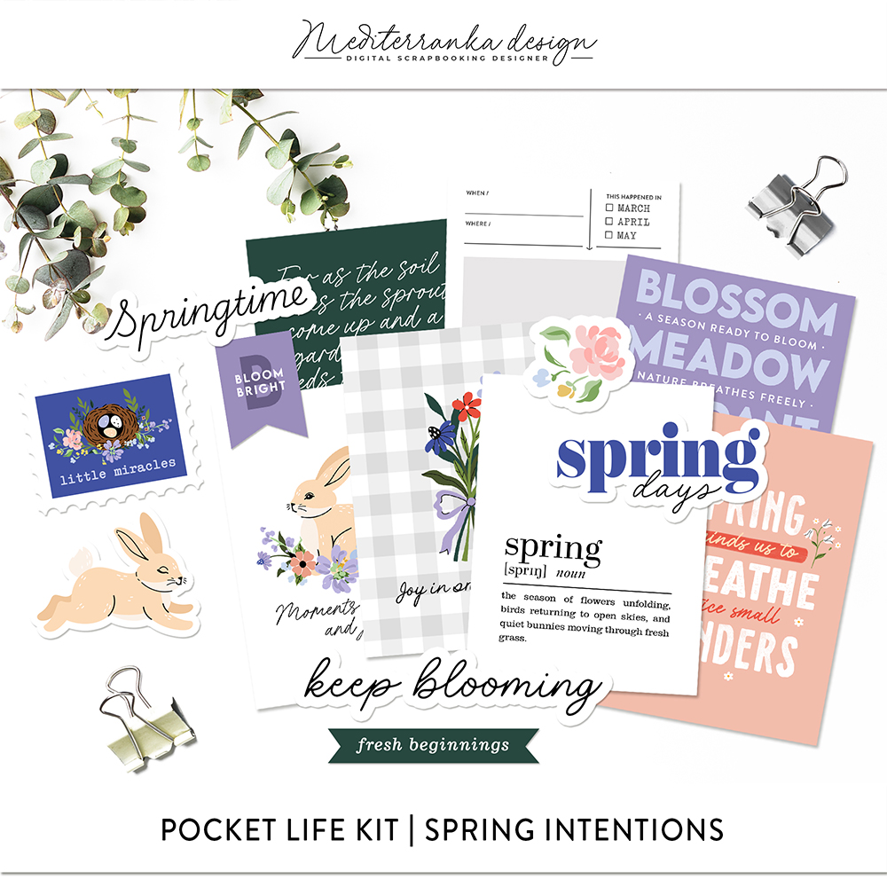
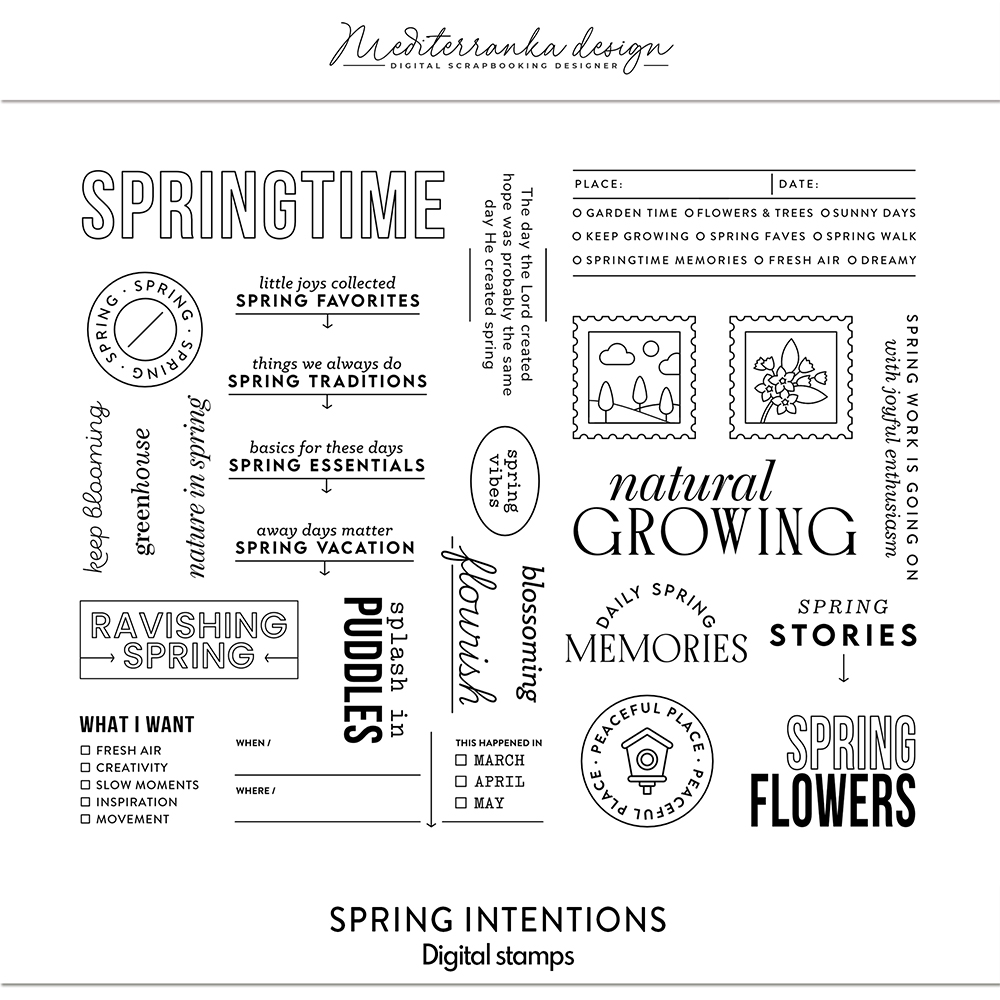
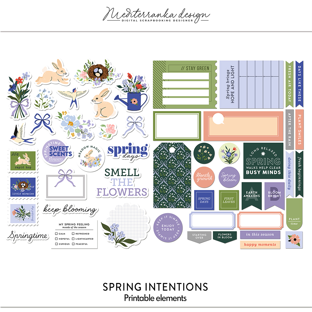
PRODUCTS I USED IN THIS TUTORIAL
Olesya Rudenko Manaz
Hi there! I’m a graphic designer, scrapbooker and storyteller. I enjoy creating quality supplies to make scrapbooking and storytelling easy, fun and practical for you.

Spring prompts
